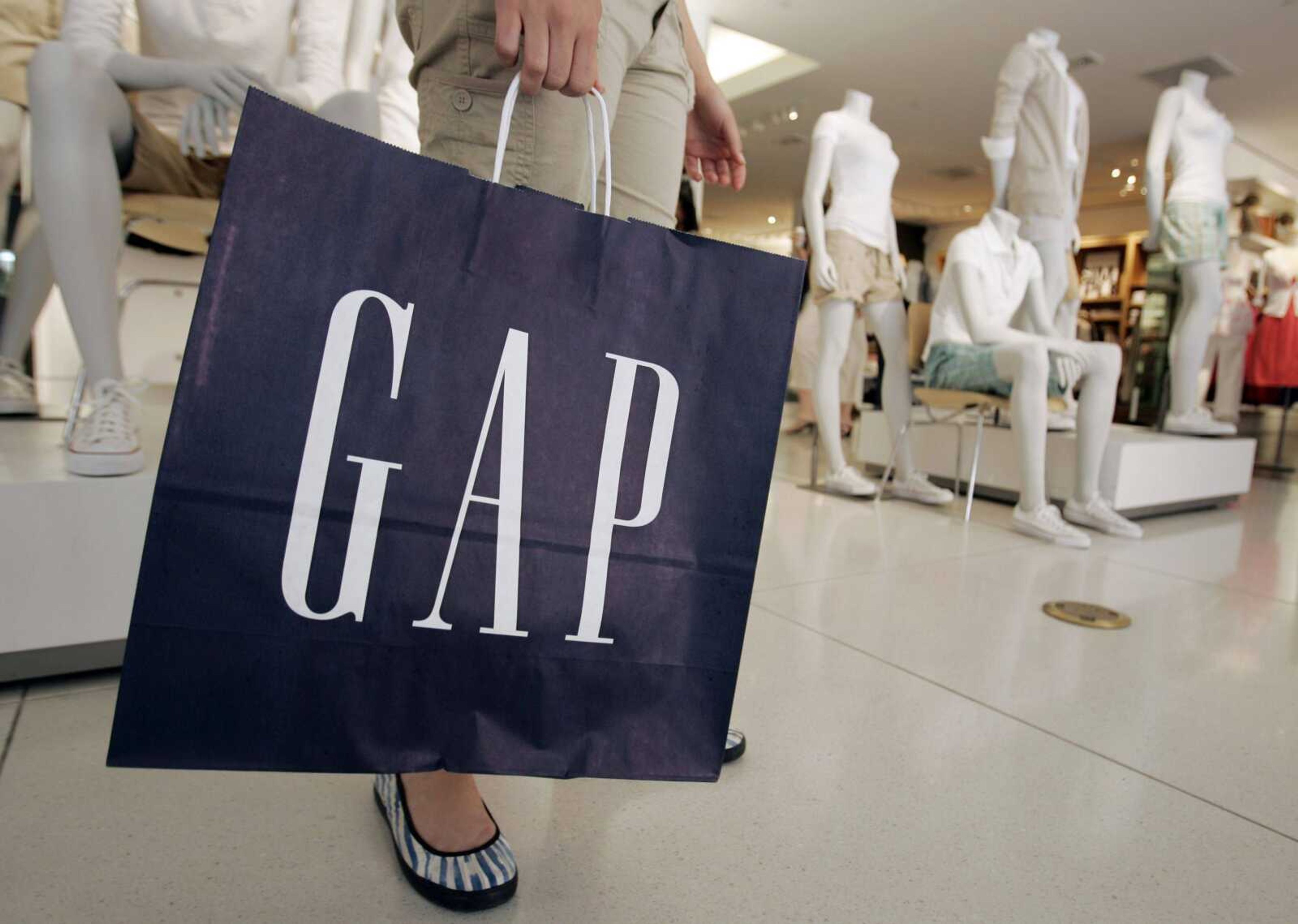
New Gap logo misses mark with fans
NEW YORK -- Gap is taking a lot of flak online for stealthily swapping out its decades-old white-on-navy blue logo. Fans are puzzled, even irritated, and an expert is calling the way Gap Inc. has handled the switch "pretty stupid." But the iconic chain still plans to add the new logo -- a white background with black letters and a little blue box -- to its stores and advertising next month. ...
NEW YORK -- Gap is taking a lot of flak online for stealthily swapping out its decades-old white-on-navy blue logo.
Fans are puzzled, even irritated, and an expert is calling the way Gap Inc. has handled the switch "pretty stupid."
But the iconic chain still plans to add the new logo -- a white background with black letters and a little blue box -- to its stores and advertising next month. A spokeswoman said Friday that Gap will unveil plans within weeks for customers to help with the new logo, which appeared on Gap's website Oct. 4.
"We love our version, but we'd like to ... see other ideas," the company was telling fans by Wednesday on Facebook -- where it's still using the old logo, the blue square with white capital letters.
It's not clear what kind of help Gap has in mind -- making changes to the new design, creating an entirely new logo or contributing to other parts of Gap's branding. The company hasn't touched the looks of its other brands -- Old Navy, Banana Republic, Piperlime and Athleta.

The new design was meant to show how the Gap chain has evolved from its long-standing, even preppy image. It's meant to complement Gap's sleeker new designs, new fits for black pants and khakis and more modern feel, spokeswoman Louise Callagy said.
"We want our customers to sit up and take notice of all of this work and view us differently," she said.
Well, they noticed.
Critiques of the new logo were buzzing on Facebook, Twitter and tech blogs last week. The new logo, which Callagy said the San Francisco-based company wanted to put out slowly and well before the holidays, retains hints of the old one. But the blue square has shrunk and wandered to an upper corner, and it's dominated by black letters in Helvetica type.
"I don't see any reason to change something that works. 'New Coke' anyone?" said one Facebook user, referring to Coca-Cola Co.'s famous missteps when it attempted to make a new version of its top-selling drink.
Another Facebook member wondered: "Coca-Cola and Ford have had the same logo for much longer than 20 years, and they manage to keep the brand current. Why didn't you try that as well??"
Callagy said the company was surprised but pleased by the spirited response, and it intentionally launched the design without fanfare, though it didn't plan all along for the fan-participation element.
The new logo represents a change in personality from one that was distinctive and familiar, said Tony Spaeth, president of Identityworks, a consulting firm in Rye, N.Y.
Switching the letters from all capitals makes the name less of a mystery -- something that draws shoppers in, he said. Now, people will view 'Gap' more as a simple word, not anything to wonder about, and won't be curious what the name means. (In fact, it refers to the generation gap that existed in 1969, when the company was founded, Callagy said.)
Spaeth also said Helvetica is something of a "logo cliche," used by older, less modern brands such as H&R Block Inc. and the New York Stock Exchange. It's also the typeface of New York City's transit system.
Companies unveiling new logos should tell consumers what to expect before putting a design into circulation, Spaeth said. And they should explain their reasons for such a change, which can be a major turning point for a company. Not only did Gap miss an important chance, it now must deal with negative publicity, he said.
"It's an opportunity to tell a story, to communicate, to take advantage of people's interest," he said. "It's pretty stupid not to jump on that."
And leaving the fate of the company's logo at least partially to submissions from fans?
"That would be bizarre," Spaeth said. "I think this is just, 'Whoops we made a mistake here, and how can we cover our tracks?"'
Connect with the Southeast Missourian Newsroom:
For corrections to this story or other insights for the editor, click here. To submit a letter to the editor, click here. To learn about the Southeast Missourian’s AI Policy, click here.


